Design Evolution
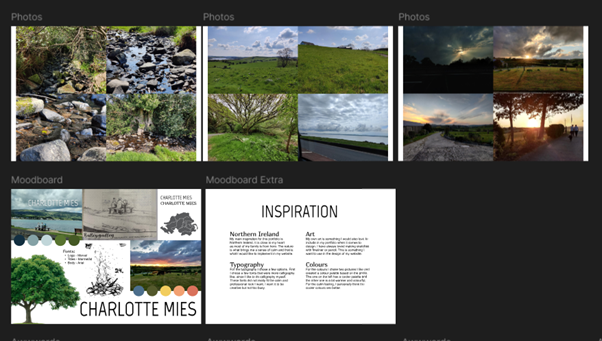
Starting out, I struggled with figuring out what to do for my portfolio. Based on my teacher's feedback, I began with an initial brainstorm and started exploring different concepts. This eventually led me in the direction of nature as a theme.
I created a moodboard that focuses on typography, minimal design, and a natural, calming aesthetic.
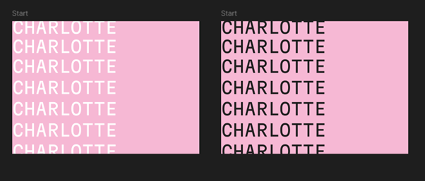
One of the other things I tried was a bold, typography-based design. While I didn't stick with that bold style in the end, I really liked the idea of incorporating pink into my website, since it's my favourite colour, it felt like a nice personal touch.
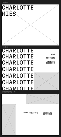
While I hadn’t fully decided on a theme yet, I started creating this layout in Figma to get a better feel for the overall structure. I didn’t continue with this specific design, but from the start I knew I wanted to use a title page and go for a one-pager layout for my homepage with clear sections. In the layout on the left, you can still see the idea of using bold typography. However, I eventually decided to keep things simpler and chose not to move forward with that style.
UX Research & Implementation
I decided to explore some 2025 UI/UX trends to get more inspiration. To see that research, click here to download the
file.
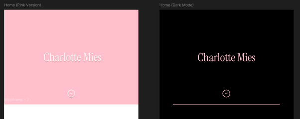
I decided I want to continue with the pink theme and use glassmorphism/blur effects on my website.
I also want to explore dark mode.
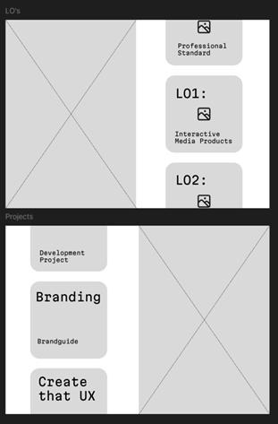
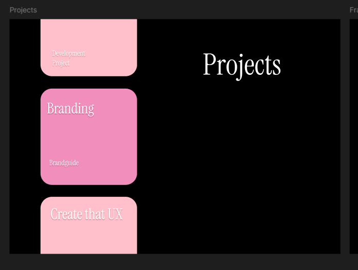
In the images below, you can see the Figma designs for the projects page and the first draft of the about me page. The idea behind the design for the projects page, which I also plan to use for the learning outcomes, is to have a sort of carousel on one side, and an introduction (and maybe an art piece) on the other. I’m not sure yet if adding a carousel will be within the scope of my current JavaScript abilities.
Development Process
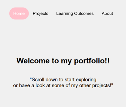
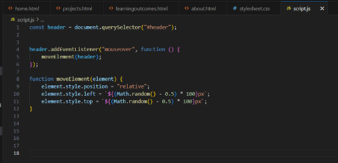
I started with the early development of my website, just the basic structure with a white background and pink accent colours. I set up the basic HTML and CSS, and the navigation is responsive. In the images below, you can see a screenshot of my website in its early stages, as well as the JavaScript code I used to make the name on the title page (which you can also see in my Figma design) move when you hover over it.
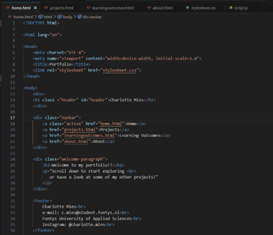
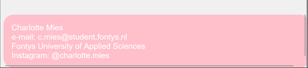
The images below show the code for the basic HTML structure of the homepage, including the fully functional navigation bar. There's also a screenshot of the footer, where I added some basic information. At this point, I hadn’t styled it much yet, just a border radius and a pink background.
Version Control
When it comes to version control, I started out with absolutely zero experience, I had no idea where to begin. With help from a Software student in a higher semester, I set up my repository and learned how to use GitKraken for committing and pushing. He also showed me how to clone repositories, and I can now confidently do that on my own.
I opened the repository in Fontys GitLab and cloned it into GitKraken. At this point, I understand the basics of Git, and on the recommendation of one of my teachers, I've used branches once or twice to test out bigger changes on my website.
I also created a README file for my website.
Click here to navigate to the Git repository for my portfolio.
Personal Reflection
I have created my first-ever portfolio and my first website. Let me start by saying that I learned a lot completely from scratch. I had zero prior knowledge, just a few tiny bits of HTML, so I'm proud of what I've put forward. While I definitely need more practice to improve my coding efficiency, I've made great progress.
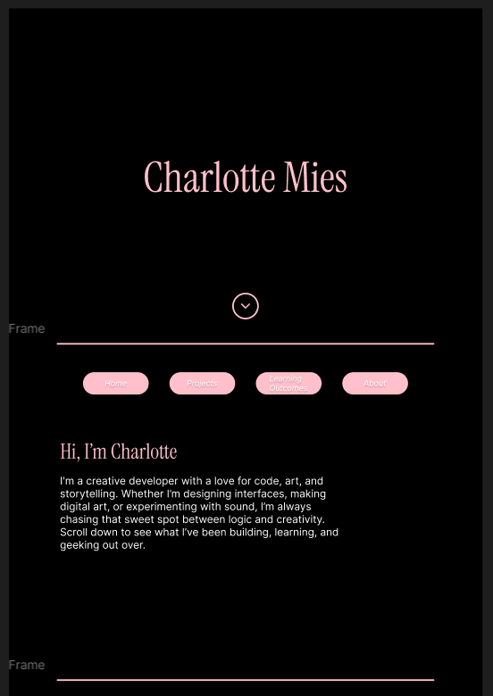
My goal was to create a simple, clean portfolio. I used a minimal colour scheme and decided to go with dark mode because the contrast looked better. I also added a few collapsibles and tabs on pages that were getting too long, this helped me improve my JavaScript implementation.
I've set up a Git environment and feel confident navigating it. The website is fully functional and includes everything that needs to be there.
There's still a lot of room for improvement. One general point that's been a consistent challenge across all my projects is asking for feedback more regularly. However, I've made real progress on this toward the end of the semester. I asked my teachers for feedback more often and checked in with my peers regularly to help improve the portfolio.
Instead of going with full glassmorphism, I simply used a blur effect on some elements. I haven't consistently implemented this across all the project/LO pages, so that's something to improve.
I've added more JavaScript interactions, like the tabs and collapsibles, and the scroll-down and click-to-replay animations on the title page. I'm happy with the JS elements I've implemented and am excited to improve them further next semester.
I've also added more personal touches, including photos of myself on the homepage. One big thing I planned to add was pages for art, music, and gaming, hobby pages in a sort of blog-like format. I didn't get around to building those yet, but there are intro images on the homepage, and the links currently lead to an "under construction" page. I definitely plan to keep developing these hobby pages in the future. Adding that personal touch just feels right.
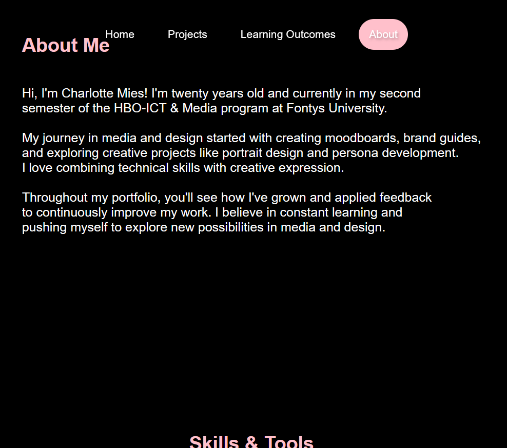
I've made updates to the navbar and footer based on user feedback, which you can see on this page. One key area I want to focus on next semester is making the portfolio more responsive. Right now, I've mainly based everything on my laptop screen, and improving responsiveness for different screen sizes is definitely something I need to work on.
Despite the struggles I've had this semester, I've learned a lot and I'm proud of the portfolio I've created.